Mobile-First Design: Why 60% of Your Traffic is Mobile | Nationwide Online Marketing
Web Design April 11, 2026 β€’ 10 min read

Mobile-First Design: Why 60% of Your Traffic is Mobile (And What to Do About It)

Nationwide Online Marketing
Official Blog
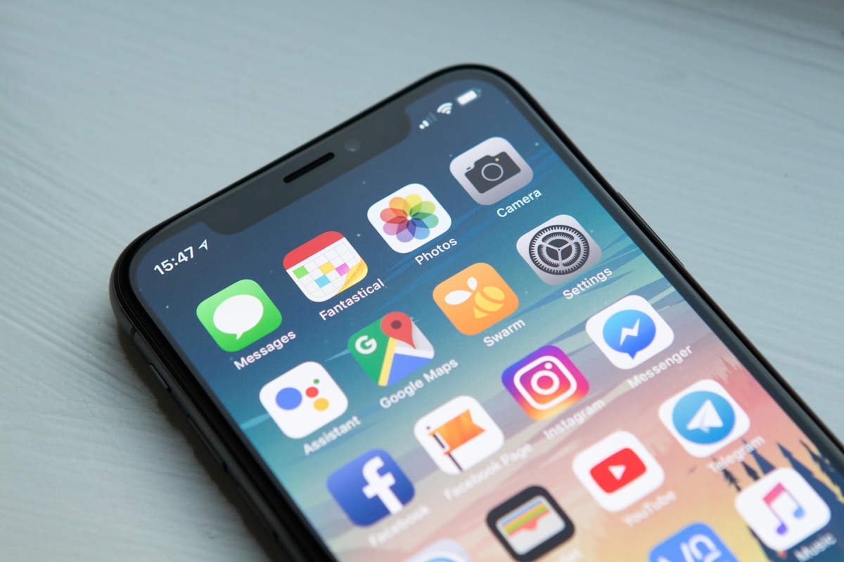
Mobile Design

With mobile devices dominating web traffic, designing for mobile first isn't optionalβ€”it's essential for survival. Here's everything you need to know.

Google's mobile-first indexing means your mobile site is now the primary version Google uses to rank your website. If your mobile experience is poor, your search rankings will suffer. This guide will help you create a mobile experience that delights users and boosts your SEO.

Why Mobile-First Matters in 2026

πŸ“± Mobile Statistics You Can't Ignore

63%
of all web traffic
73%
use multiple devices
57%
won't recommend bad mobile sites

The Mobile-First Design Approach

Mobile-first design means designing for the smallest screen first, then progressively enhancing for larger screens. This approach forces you to prioritize essential content and functionality.

Mobile-First Design Principles:

  • Content prioritization – Start with what matters most
  • Touch-friendly – Large tap targets (48px minimum)
  • Fast loading – Optimize for 3G connections
  • Thumb-friendly – Key elements in easy reach

Key Mobile Optimization Elements

  • Responsive Layout – Fluid grids that adapt to any screen
  • Readable Typography – Base font size of at least 16px
  • Optimized Images – Compressed and properly sized
  • Click-to-Call – Phone numbers are tappable
  • Mobile Checkout – Streamlined payment process

πŸ’‘ Pro Tip

Test your mobile site regularly using Google's Mobile-Friendly Test tool and Chrome's device emulation mode.

Ready to Go Mobile-First?

Don't let your mobile visitors slip away. Let us help you create a mobile experience that converts.

Nationwide Online Marketing

Expert web designers specializing in mobile-first responsive design that drives results.